I don’t think I’d recommend focusing on logo design early on in a game project – especially a narrative-heavy game you haven’t written yet! – but I am a champion at ignoring my own good advice. But in the case of Fetch Quest (or Fetch!Quest, as I have come to think of it) the narrative unfolds through a fantastical gig app (think TaskRabbit but for mythical creatures), so designing the app interface (which shares its name with the game) is an early priority.
So, in a slightly sideways approach to game design, I’ve been working on logo, branding, and UX design. Let’s look at some of it!
I know early on that I want the logo to incorporate the ubiquitous map pin icon. I think it’s brand-agnostic enough that we easily recognize it as a way to mark locations. Fetch Quest’s story unfolds by accepting tasks from characters and heading to locations outside of your mundane reality, but they’re still locations!
Here’s my first brainstorming session:
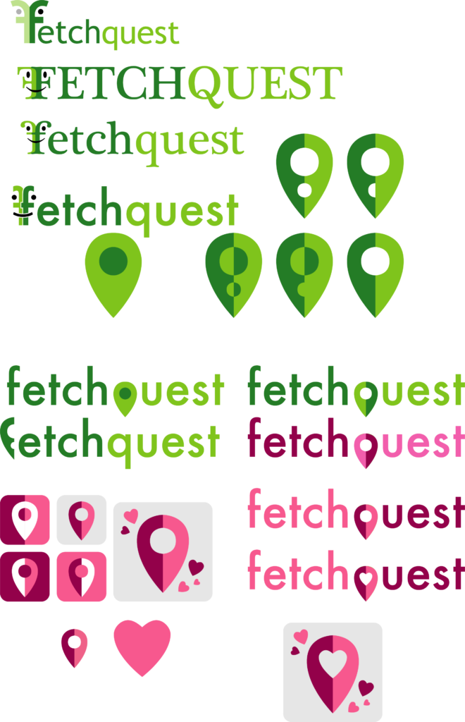
I honestly don’t remember trying out those F faces. Looking at it now it feels much too early 2000s. I ditched it quick for the map pin, absolutely destroying it by trying to stylize it into a “f” and then a “q”. I remember really liking the pinks for a while:

This was in February / March of 2020. I was satisfied with it at the time, and then time itself became a being of eldritch horror and I put it away in favor of staring at a wall.
Cut to August 2021, I’m in Florida to take care of my mom while she recuperates, and I suddenly think that learning Illustrator on the iPad would be a great low-stress activity. We’re back to trying to make that pin a “q”:

It’s bad, friends. I even tried tilting it a little to look more Qish and immediately hated it so much there appears to be no record of it. I accept my defeat like a good designer and just leave the pin in-between the two words and start to play with colors.
Something happens to my brain when the pin turns yellow. YELLOW! What is a quest if not a yellow exclamation mark?
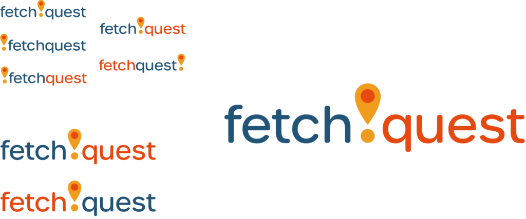
I am in a frenzy now. It’s a map pin AND a yellow exclamation mark! Yes! YES! Let’s look at typefaces!!
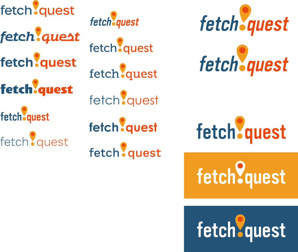
I’m hooked on this condensed “Vinyl OT”. It feels nice on my eyeballs. Corporate and Online, but matched with this palette it’s almost friendly. I am deeply satisfied with this breakthrough. I message several close friends on Discord and make them look at it. Validate me!

This holds me over until late September 2021. I’m worried that the fantasy element doesn’t come through enough. How can I fix that? Back to typefaces:
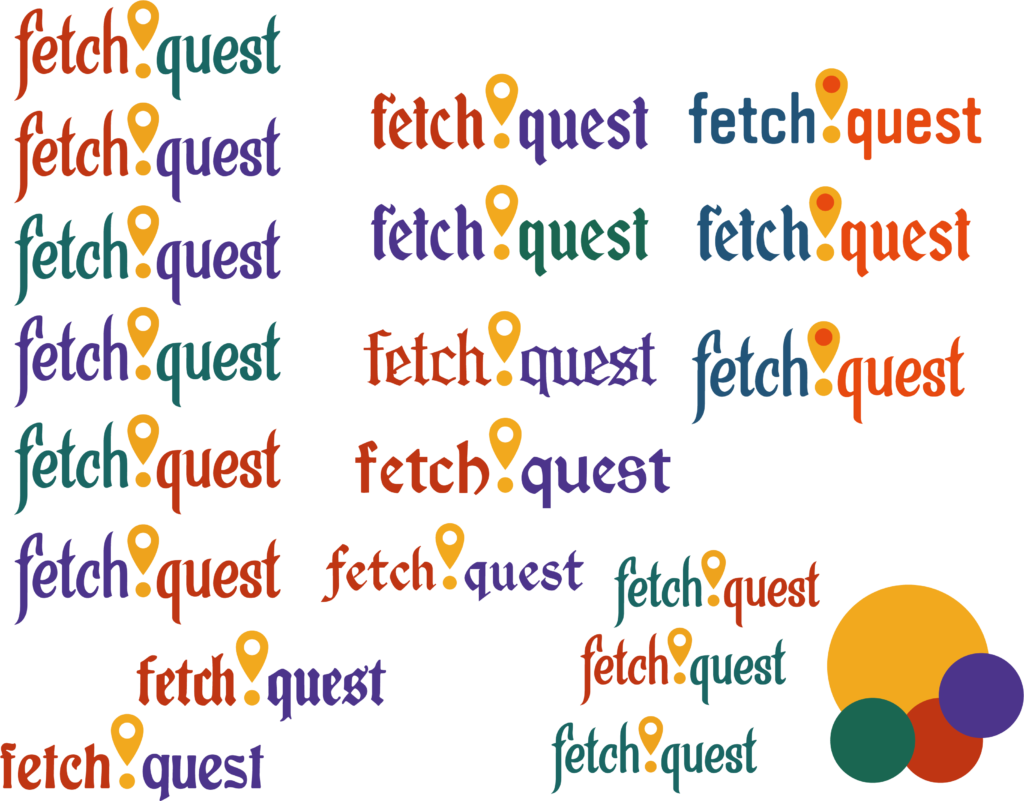
I find a lot of candidates and adjust the palette to be a little more gold-and-jewels colors. There are a lot of fun fantasy typefaces, but of course the very very free options aren’t quite what I’m looking for. As hard as I try to fight it – I even did a twitter poll! – the clear winner is “Enchanted Lands”, which I’ll need to buy an app license for as I continue with this project. BUT LOOK AT IT:
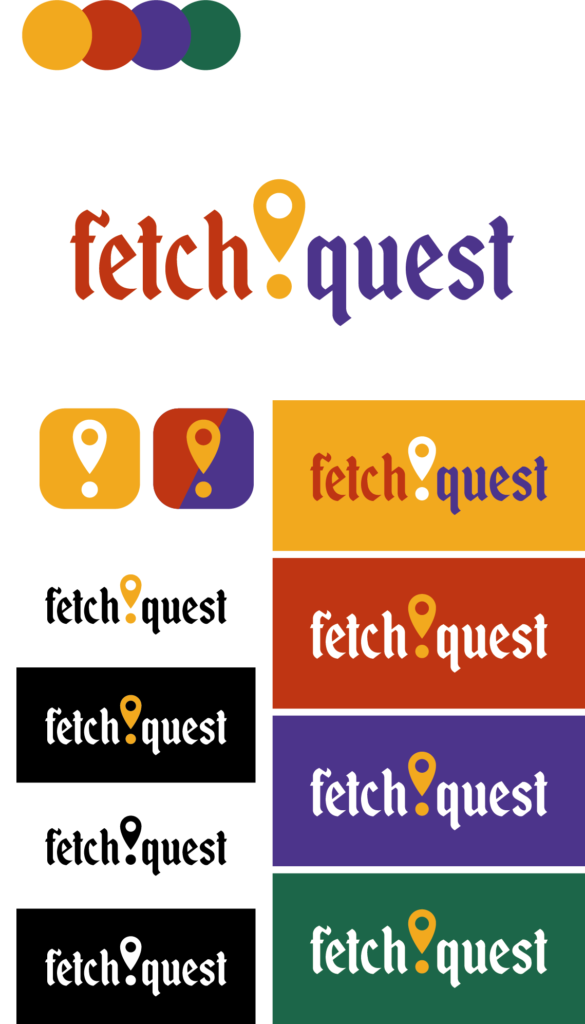
The primary color is the yellow-gold. If we’re ever in a position where we only get one color, that’s the one. It’s the identity color. The exclamation point / map pin still reads in black and white (as you can see in the bottom left treatments) but the yellow takes the pun a step further.
Red and then purple are the next two brand colors, in that order. It’s not in the logo but I kept the tertiary green for accents. The righthand column is a guideline on how the logo should appear on a field of each color, if necessary. Black & white and monochrome options are on the left. The two icons are just that – icons. I think the 3-color would be the ideal icon and then the yellow & white for limited situations.
And the typeface looks great! It gives that fairytale fantasy vibe I was looking for but still feels clean enough to be an app logo. Maybe not 100% modern, but I don’t want it to be completely modern.
I don’t think I’ll be doing any major overhauls from here, just fine-tuning color and spacing. I hope.
—–
I hope that was interesting and/or insightful! When I work on this stuff I just open an Illustrator file and iterate all over the place. It’s a mess in here!
